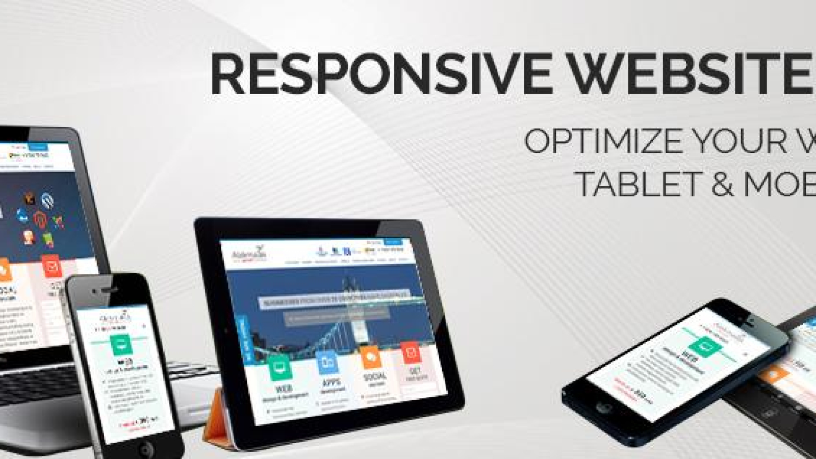
Mobile users are very goal-oriented. They anticipate being able to acquire what they require quickly and according to their preferences. To construct a successful mobile website, one needs to take into account a number of design elements. Key in all this is keeping User Interface needs in mind, so that going through your website never feels like a chore for the user.
Homepage and site navigation
Having everything that must be “instantly clicked” front and center as soon as the page is opened is frequently quite helpful. This comprises menus, pictures of the newest products, and external links.
Speaking of menus, it would be advisable to add these to the navigation bar of the website, so that the home page isn’t cluttered up. This would facilitate the easy availability of all of your consumers’ most frequent tasks. Make sure they are sweet, succinct, and simple to browse. Provide a button on the home page that allows users to quickly return to the top of the page from wherever on it. It would be a good idea to have this function on all pages of the site.
Site navigation is crucial for all of your products if your website is an online store. Users will browse your site and then add items to a cart as they go along, buying at the end. To buy, you will need personal details from them; card number, email, etc. The question arises, how to structure this?
Generally speaking, most users will avoid a website that requires them to sign up for membership in order to access it. In order to protect their emails from possible spam, people who make regular purchases from a website could also decide without becoming members. Plus, going through lots of products would be a nightmare on a smaller screen without organization. Thus, establishing a “2 items at a time” grid system, or something similar, would be integral to make the user interface easier to navigate. Furthermore, permit clients to peruse without membership and make purchases as visitors. They will subscribe to your service if they want regular updates. It will make things easier for your web traffic. Starlinks is an excellent e-commerce website to learn from, as evidenced by the prominent displays of their web design and SEO services.
Responsive Web Design
Having a responsive web design means that the webpage layouts can change based on device characteristics, as well as the content. This is essential if you wish to run your website for PC users as well as mobile phones. For example, on high resolution (2x) displays, high-resolution graphics can give assurance in regards to sharpness of image quality. An image that is 50% width might be okay when the browser is 800px wide, but it would need to be reduced depending on the size of the browser, which will certainly change on mobile.

